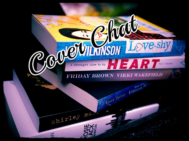
Cover Chat: Hooked by Liz Fichera
Earlier this week, I reviewed (and recommend, with reservations) Liz Fichera's debut novel for teens, Hooked. However, I keep coming back to the cover--it just doesn't work, in either the U.S. or Australian edition.
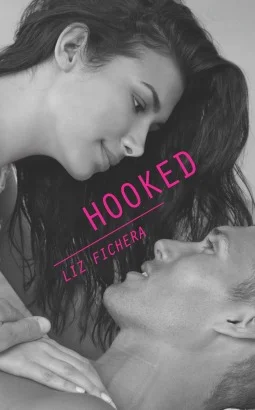
Hooked by Liz Fichera (US Cover)
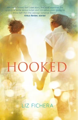
Hooked by Liz Fichera (Australian Cover)
Three things lingered with me after I finished reading Hooked:
- It's not a romance;
- Setting is almost a character in and of itself; and
- It's a rare YA novel in that it really got the "feel" of sports right.
Unfortunately, neither of the covers convey any of these things--and both emphasize the romance, which actually only gets a small amount of page-time. Sure, there's lots of secret crushing and wistful longing, but really the two characters are at odds on some level through much of Hooked. If I picked up this book based on the cover alone (which people do), my expectations would not be met. This is particularly the case if you consider the full front and back image, which promises a "sexy" read. (I actually really like the full design--much more than just the front cover--and love the way diagonals are used in the text.)
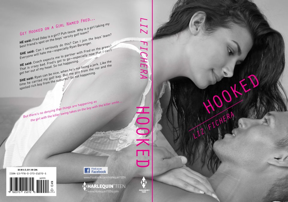
Hooked by Liz Fichera - Front + Back (US)
In terms of setting, the Aussie version at least feels like it could take place in the hot Arizona sunshine, with the golden tones and lens flare (I am a sucker for lens flare--check out this post over at Stacked in where Kelly rounded up all the new lens flare covers). But the black and white of the American edition does the opposite of that (though at least the female model looks like she may be Native American).
And, there's no golf, or an indication of golf (unless you count the plaid pants/possible board shorts worn by the male model in the Australian edition). It's a known fact that I don't care for the "sports" novels by Miranda Kenneally, but I will say that Sourcebooks does a good job with those covers in terms of conveying that the girls in those books (theoretically) do stuff.
While I understand that the point of book covers is to market books, I often wonder if covers that in no way reflect the actual content of the book hurt more than help (look at the many, many negative reviews for The Disenchantments, which cite the cover as misleading).
If I had to choose one, I'd go with the Australian cover, because it feels livelier, and I think that makes more sense for the story, but I'm not satisfied with either. What do you think?
Support Clear Eyes, Full Shelves
Buying via these links help support our hosting & podcast production costs.


Links + Things: Alpha A-holes, Book Marketing and Delayed Ebook Releases